By Bega Murray
As researchers, we have a responsibility to communicate our scientific findings clearly and comprehensibly to broad audiences. Graphical abstracts, or short, visual research summaries, are becoming an increasingly popular format to improve the accessibility of major scientific findings. Many scientific journals now request graphical abstracts to accompany manuscript submissions to enhance a paper’s visibility and impact, especially across social media platforms like LinkedIn and X (formerly Twitter).
Last fall, iJOBS hosted an educational seminar on how to generate a graphical abstract using BioRender, a design platform providing pre-made icons, templates, and designs. This seminar covered three core details when designing a good graphical abstract: layout, color, and the appropriate use of lines and arrows, along with practical tips and tricks to create clear and engaging graphical abstracts in BioRender. Continue reading to learn some pro tips and BioRender basics.
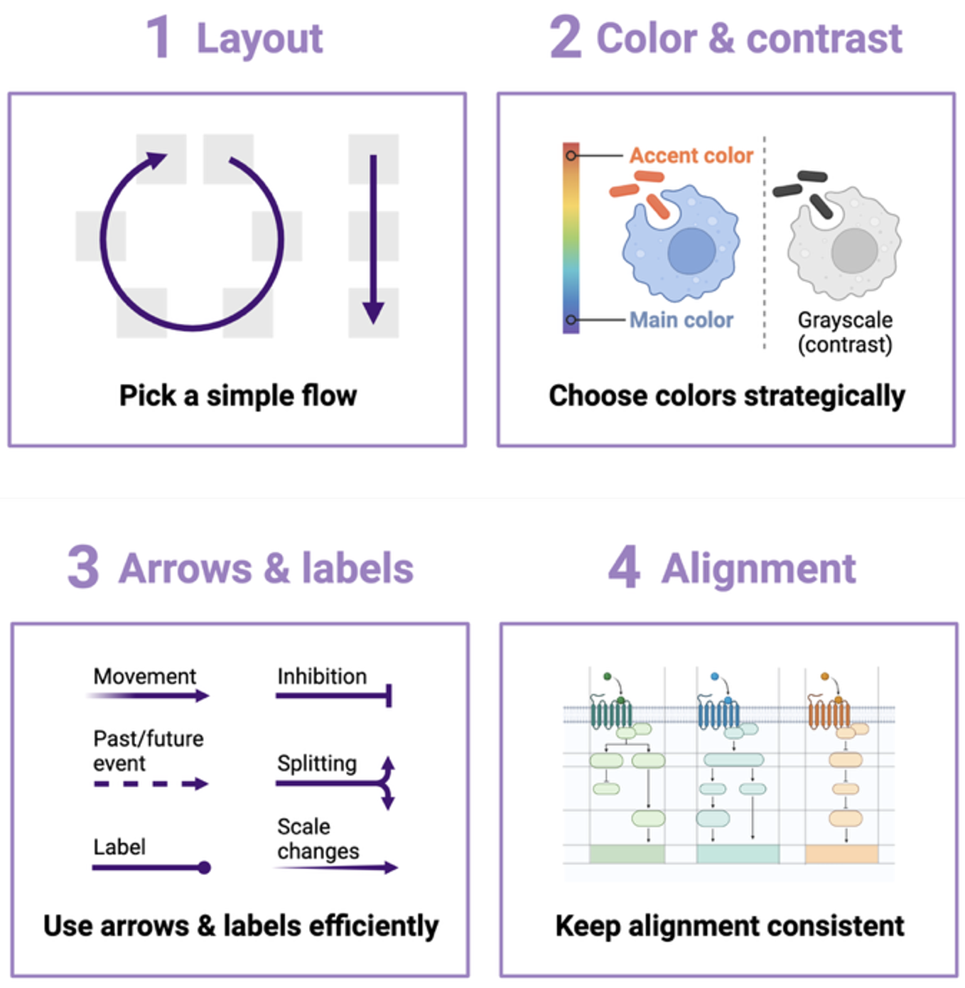
Layout
Pro tips:
- Plan the key elements of your design
- Simple compositions
- Use negative space
The first step in designing a graphical abstract is to work out your preferred layout. It was recommended to sketch out your layout on paper first to spatially organize the key findings of your research. Generally, simple compositions, such as guiding your audience through the graphical abstract from left to right, top to bottom, or in a circle, are best. This will make it easy to understand the directionality of events. Additionally, do not be afraid of white space or negative space. White space provides “visual breathing room”, allowing viewers to better digest the information. It is also important to maintain the alignment throughout your abstract. The use of gridlines during your Biorender design process can help to stay oriented.
Color
Pro tips:
- Simplify your color palette
- Use the transparency of objects to highlight key components
- Use contrast to enhance visual accessibility
There are several important factors to consider when choosing the colors for your graphical abstract. First is color association—a tendency to mentally group colors regardless of how related they are in a given context. For example, we assume two different shades of purple cells are more closely related than red colored cells. Carefully select colors to encourage grouping of related items and avoid grouping of unrelated items. Color temperature also plays a role in our color association. Generally, warmer colors (reds, pinks, oranges) are associated with villains, while heroes are more frequently associated with cooler colors (blues and purples). Therefore, you may consider using warm colors for ‘villains’ in your graphical abstract (e.g. cancer cells) and cooler colors for ‘heroes’ (e.g. immune cells). When possible, limit your color palette and keep colors consistent throughout the figure to improve clarity.
During the seminar, we also learned about the use of color contrast, which is a value equivalent to how much white or black is mixed into your color of choice. This element is very important for visual accessibility, such as when presenting your work to people with visual limitations and color vision deficiency. Though you may be limited in your choice of color for certain objects, if you want to highlight something within the object, you would choose a contrasting color that draws the audience’s attention to this point. For example, you can highlight important items in your figure by making them transparent.
Lines, Arrows, and Labels
Pro tips:
- Different line styles can indicate specific information
- Highlight focal regions of interest
- Use minimal labelling to enhance understanding
Lines, arrows, and labels are key elements in a graphical abstract design. In BioRender, you can manipulate lines, arrows, and labels using the scissors tool. Different styles of lines and labels can be used to add context and clarification to your graphical abstract, highlighting focal points and regions of interest. For example, the thickness of an arrow can indicate quantities or movement, while dotted lines can be used to show future states (see figure 1). Labels should be of a readable size and font, using consistent terminology.
Learning how to effectively describe your research in a graphical abstract is becoming an essential skill for early-career scientists as this format becomes more widespread across scientific journals. BioRender is just one tool available for graduate students and post-docs to generate graphical abstracts and other visual diagrams. If you’re interested in using BioRender for your next publication or presentation, find out more about a discounted subscription plan for Rutgers students here.
This article was edited by Junior Editor E. Beyza Guven and Senior Editor Antonia Kaz.