By Natalie Losada
As scientists in academia, we are expected to, and sometimes very eager to, publish our findings in scientific journals. When you start to write up your work, you gather all your data and make the best and most informative figures you can (hopefully using the tips and tricks from the iJOBS post on figure design). But with the increasing presence of science in social media and the need for scientific literacy in the public, the demand for graphical abstracts summarizing the key conclusions of publications has also increased. But worry not; this iJOBS event summary can provide you guidance for building your graphical abstract and will introduce you to a powerful new image-building tool.
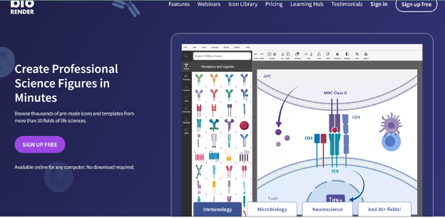
Mid-June of 2023, iJOBS hosted Erica Seelemann (virtually) for a graphical abstract workshop. Erica received her BSc in neuroscience and her MS in physiology and biophysics from Dalhousie University and is now a Science Communication Associate at BioRender. The BioRender company facilitates the figure-making process for scientists. You can work directly with their employees to design figures or make them yourself on their website. The platform is overflowing with different image icons for almost any experiment, from cellular structures to lab equipment to proteins to small molecules, and you can always upload your images to your BioRender account. As someone who has used BioRender to prepare publication figures, posters, and slideshow presentations, I can attest to its robustness and ease of use. It has every image editing feature you need, and it doesn’t take long to learn where all the tools are located in the interface.

Now that I have properly hyped up this figure making tool, we can review all of the helpful tips that Erica provided us at this iJOBS event for making graphical abstracts. First, she defined a graphical abstract as a single image that allows your reader to understand the main message of your story/paper at first glance. Remember, your graphical abstract is not meant to be a copy or piece of your results figures in your manuscript – it stands alone to represent the whole manuscript at once or the most important takeaway from the manuscript.
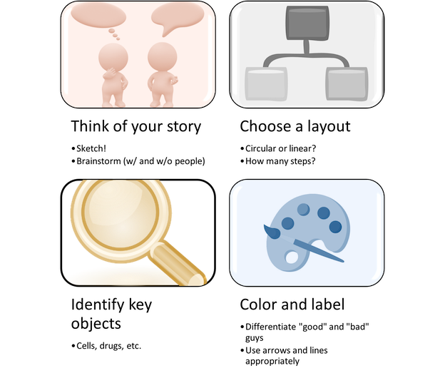
The actual process of making graphical abstracts is simple, but it requires time for brainstorming and sometimes patience (Figure 2). The first step is always the hardest: think of your story. When your audience looks at your figure, what conclusions do you want them to draw? Is there a problem and a solution you’re publishing? Is there an improvement to previous technology? Do you have a new workflow to accomplish a certain task? These take time to think about, but if you sketch ideas as you go (Erica highly recommended you do this, truly sketch, on paper), you can get through the process efficiently. Once you know what you want to convey, the next step is choosing a layout appropriate for the story. Sometimes you can draw the story linearly, but if you have many steps, just make sure you draw left to right and up and down. Sometimes you might even have a cyclic story, in which case you should draw the layout clockwise. If you spend enough time on the first step, the layout will come naturally.

The third step is to make a list of all the different objects you’ll need. As mentioned above, BioRenderhas an enormous library of scientific icons you can use to illustrate your story, and you can upload anything extra you need. Once you have all the “materials,” the last step is to color and label. You will have to color the “main character” objects and “supporting actor” objects differently. Erica explained that warm colors (i.e.,reds, oranges, and yellows) should be used for the “bad” guys, like viruses, and cool colors (i.e., greens, blues, and purples) for the “good” guys, like human cells. For the other “supporting actors,” you should make them look as neutral as possible by choosing less saturated colors or increasing the transparency of the objects (~40%). Using less saturated colors and increasing transparency proves very important when trying to make figures colorblind-friendly. BioRender is still working on a feature, as Erica explained, to effectively color illustrations for a colorblind audience. But until then, Erica suggested creating contrast by choosing different colors of different saturation levels to make them as distinct as possible.
You’ve probably already heard the tip to use less text when making figures, but Erica clarified that you should also use fewer total colors to create more white space and keep the figure from looking too busy. You can also crop objects to only show the parts you care about and create more white space. When labeling all your strategically colored icons, Erica recommended using the circular arrowheads for naming objects and saving the pointed arrowheads for transitions or things that move. With the rounded arrowhead, your eye stops on the object you’re naming, so it’s a subtle way to add a little more clarity to your figures.
The last unofficial step is to have others look at your figure to tell you if they can understand the conclusion you are trying to convey. Getting feedback at every step is ideal, but especially before publishing every person’s input is extremely valuable to making a clear, concise, and beautiful graphical abstract. Additionally, the tips shared here can work with whatever software you choose, other than the icons, but follow the process and you can get better figures every time. I hope this helps you in your illustration process and I encourage you to make the image something you enjoy looking at too!
This article was edited by Senior Editor Shawn Rumrill and Senior Editor Sonal Gahlawat.