By Natalie Losada
Together with BioRender, iJOBS hosted a short and sweet event to explain how to build a scientific poster. If you read the last BioRender iJOBS article covering making graphical abstracts, then you’re also in good shape for making scientific posters. Many of the key aspects of figure design are relevant to poster design. If you’re currently struggling with designing a new poster or trying to improve on previous posters, then keep reading for these surprisingly subtle but powerful poster tips.
The process of designing a poster is similar to a graphical abstract design. In both cases, you must first plan out a logical flow of information to tell a story. Remember that any story needs the following three components:
- what makes the topic interesting, e.g., why should the audience care?
- what information should the audience know ahead of time, e.g., background information on the topic and/or how experiments were conducted?
- what did you learn that is new and how will that influence the future of the project or the field?
Once your story is laid out, you can start planning visual representations for each section. Before you ask… yes, every major section can and should have a visual representation of information, even if it’s a simple flow chart with key word descriptions. To keep the audience engaged, your poster must be instantly digestible and not require time to read many paragraphs to understand the project’s story. Hence, using visual aids in each section decreases the total time spent reading the poster.
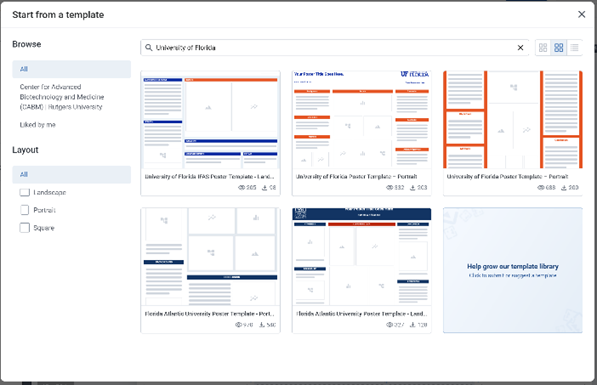
If you take one thing from this article, let it be that color has a lot of power in your poster. You don’t want to use too many different colors because that will be distracting. You should choose a specific and consistent color palette for your poster and use different colors to highlight important conclusions. This is where using poster templates from BioRender becomes extremely helpful. The color palettes are already chosen to be the least distracting and guide the viewer to the key findings in the Results section. BioRender even has many university-themed templates to choose from (Figure 1) that match your school’s logo colors while making a cohesive poster design (Figure 2).
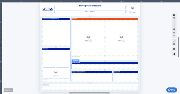
results section is shown in a different color to make it stand out.
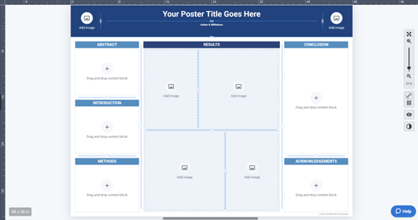
Even if your university is not listed or you are making a poster without BioRender, the concept remains the same. Pick a consistent color palette. Blue is very good because there are many distinguishable shades of blue. As seen in Figure 2, you can use a very light blue for the background, a medium blue for the Poster title and affiliations, and a very dark blue for the section headers. Importantly, the BioRender representative pointed out that you should make the Results section different because that is the main attraction of your poster, and the entire poster becomes easier to understand when you make this section distinct. Alternatively, if you don’t want a different color, you can give the Results section box more focus by making it a slightly darker shade of your main background color (Figure 3). If you have the ability, making sure your figure colors stay within the same poster color theme is helpful, but not necessary if you follow the given tips!
At this point, you have all your poster content, but you might still be a bit overwhelmed thinking about fitting it all in the poster. Take a breath. Remember, while you want to include enough information to inform your audience, you can’t make the poster too busy. Our BioRender representative said very concisely, “use your words wisely!” There usually exists a shorter way to communicate the same information. Additionally, you should keep white space between poster sections as natural separations that keep content organized without adding clutter. You can use the “justify” function for your text to create imaginary boxes that separate each area of your poster. The BioRender representative showed the audience the subtle power of using justification with a small paragraph versus outlining the text, and the justified non-outlined box looked the cleanest, most inviting, and allowed more space for text. If you’re really dedicated to making clean imaginary boxes around your poster text, it was strongly recommended to get rid of “orphan” words, i.e.,words that sit by themselves in the last line of the paragraph. You can click on this link to get help removing them, or you can simply change the font size of your text by one or two points up or down.
As a graduate student who has mentored multiple undergraduate students through their scientific poster development, the most common piece of advice I give is that you can and should design the poster around your project. If you are presenting a project where the conclusions can be presented and summarized in two graphs, you don’t need to make ten more graphs for the sole purpose of filling out the Results section of your poster template. The same can be said for any section of the poster. You can adjust the template sections to the sizes needed for your project. This may take some time to work out the sizes of each poster section, but if you’re struggling, you always have your colleagues or your advisor to help you figure out what material to add or remove.
The last few tips are about making your poster look professional at a scientific meeting: use simple font styles, make font sizes consistent, and include a “Contact” section. More and more researchers are including QR codes with LinkedIn profiles and an email address to keep in contact while you build your network at these professional meetings!
If this article has convinced you that you need BioRender, you can check out this link for help getting an academic subscription, or talk to your department/university about getting a subscription that will benefit researchers in every lab.
This article was edited by Senior Editor Shawn Rumrill and Senior Editor Sonal Gahlawat.